A company’s logo is its first point of recognition – it tells the customer what to expect from the company in terms of standard and quality and gives a lasting visual impression.
From Apple to Coca-Cola, many of the most famous brands in the world have completely transformed themselves through their logo, whether staying deliberately retro, or re-designing with every new design trend.
As part of OWB’s 20th anniversary celebrations, we’re taking a look at our logo evolution, and how we have become the brand we are today.
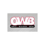
You can clearly see from our first iteration that we quickly lost our full title of Oakley Wilkinson Bryan and went to just OWB instead. When we first started out, the excitement of having your own business and seeing your name up above the door was very appealing. A few years down the line however and you realise it’s not that important – apart from being quite a mouthful too. So now we are happily known as OWB: a little snappier and less indulgent!
Let us know what you think of these retro OWB logos – which would you send to logo heaven, and which is your idea of logo hell?
-

-
Logo 1 – 2000
The original OWB logo – starting the red and black colour scheme.
-
-
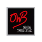
Logo 2 – 2008
Showing our creativity with this hand-written scribble logo, maintaining the black and red brand colours. The tagline was also first introduced at this point to make it clear what OWB’s core business activity was.
-
-
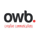
Logo 3 – 2010
Logo 3 – 2010 Again, the colour scheme stays. But this logo moved into a much more modern style, including using the ‘lower case’ trend, popular at the time.
-
-
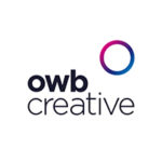
Logo 4 – 2018
Logo 4 – 2018 A complete departure, losing the black and red colour in favour of a more ‘media’ style brand. This logo represents our full-circle marketing approach to all elements of creative marketing, advertising and media.