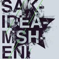
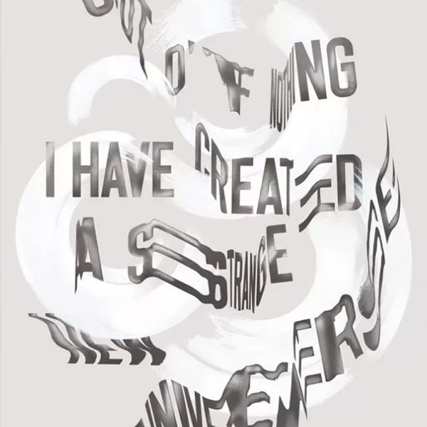
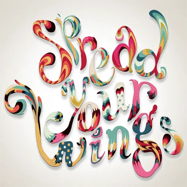
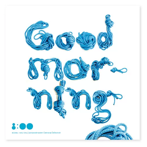
When it comes to marketing that cuts through the noise, designers often experiment with using different elements and interfaces to make a piece really stand out. More and more, we’re seeing this experimentation lend itself to altered shapes, positioning and effects applied to typography – EXPERIMENTAL TYPOGRAPHY.
Whether it’s creating an entirely new typeface or using an altered font in a perhaps unusual way, experimental typography is a way of making your marketing work look different if you perhaps don’t have the budget or scope for bespoke photography.
Although it might seem like an ‘all bets are off’ approach to design, there are still a few key things to consider to ensure that your piece lands in the right way, is legible, and ultimately sells your business and services/products.
Space
Experimental typography can be busy – it’s certainly a maximalist trend. So to aid the eye when focusing on key messages and calls-to-action, letter spacing and form spacing must be considered. A good balance of wording and white space on the page makes it attractive and catches and holds the viewer’s attention for all the right reasons.
Going Digital
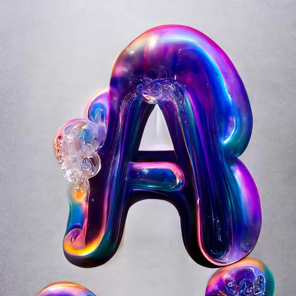
There is SO much that can be done in the realms of digital design relating to typography. It allows us to use complex lighting and textures, as well as the manipulation of various letters and shapes to form a cohesive, engaging design.
Textures and Tones
Using textures, depths and tones to construct surfaces can add an additional dimension to typography work, and literally make your wording pop off the page!
Experimentation with designs and typography can be incredibly engaging and sparks endless creativity! If you want to look at a different approach to your marketing collateral, speak to the team that CAN-DO today.
