Rebranding is and always will be a slippery slope, just look at Airbnb. They found this out the hard way with some people taking to social media to express their thoughts, some referred to it as twee, whilst other pointed out the unflattering anatomical comparisons. However, when Twycross Zoo came to us in 2015 wanting a new brand and a new logo, we jumped at the task for a zoo rebrand!
The Problem
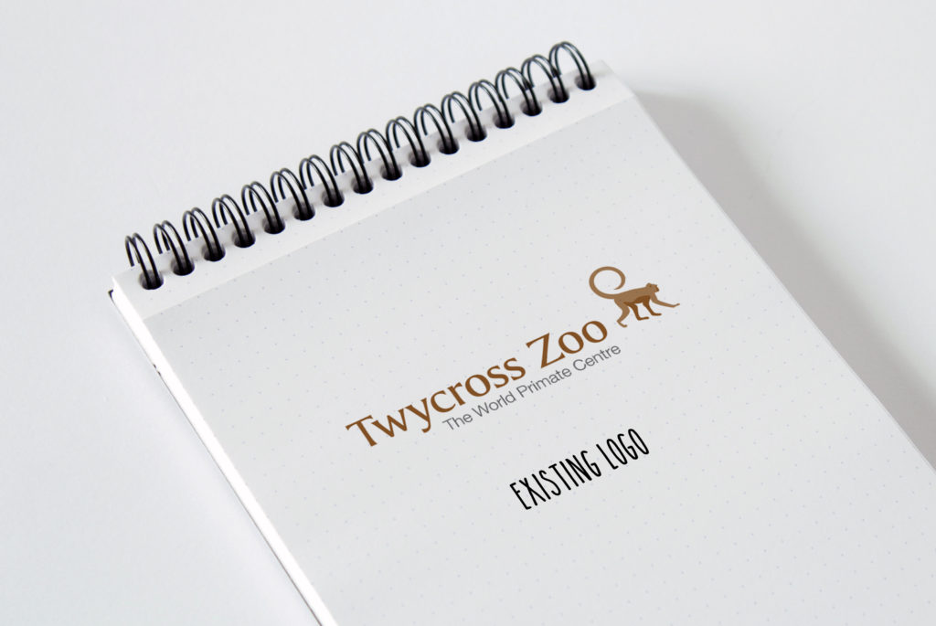
The Twycross Zoo logo had become dated and they had quickly realised they needed a change. They wanted to challenge the brand, to engage with the public further and to bring in new and repeat visitors.

The Brief
Twycross Zoo wanted to modernise and evolve their brand to help reinforce their position as the UK’s leading primate zoo, to highlight their improved facilities, new animals and ever growing customer offer. Twycross Zoo wanted to be a place to explore, to find out more about new habitats, to widen horizons and understanding of the animal kingdom.
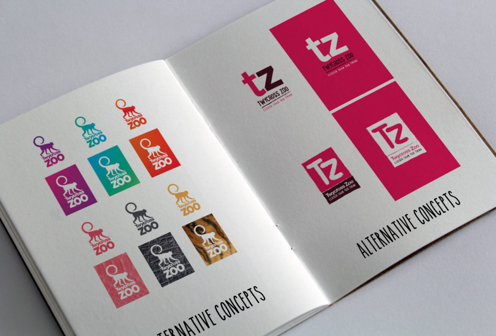
The Other Concepts
We worked through a number of concepts. Starting with scamps and then evolving these into design layouts until finally moving into our chosen logo.

The Result

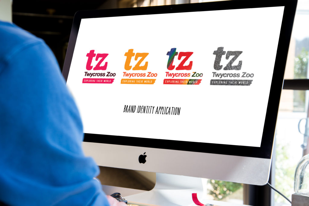
The new logo was versatile with distinctive colours to make them stand out. It could even be adapted to include animal textures.

They had a 137% spike in website traffic in same week this campaign was launched, with visitor numbers increasing 25% year on year.
The new logo gave Twycross Zoo a fresh and engaging new identity which encouraged interest. It also set Twycross Zoo up as a fun and modern destination.
The tagline, ‘Exploring their World’ worked two ways. It encouraged visitors to explore their world whilst also showing that Twycross Zoo are working with, exploring and learning about the animals.
To see more of the fantastic Twycross Zoo creative we produced, click here.


