Branding helps to distinguish one player in a market among its competitors, creating lasting impressions in the minds of customers. However it’s becoming increasingly difficult to differentiate from competitors and connect with target audiences.
How effectively you rebrand can make or break you, leaving a lasting impression on consumers and their overall brand perceptions. There has been some spectacular branding fails in the past that have caused outrage among customers, that lessons can certainly be learnt from! Here are our top picks, what on earth were some of these brands thinking?
Tropicana rebrand
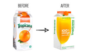
Change is not always a good thing as the beverage company, Tropicana soon learnt. In 2009 they decided to rebrand all elements of their well-known product, creating simpler packaging and a new logo design. The result was a debacle for Tropicana and spelled disastrous consequences for farmers and the company, as consumers basically didn’t recognise the brand anymore! Sales dropped by 20% until they reverted back to the familiar design.
In 2010, clothing retailer GAP changed the iconic logo that for years customers have connected with GAP. They opted for the brand name and a little blue box on top of the last letter.Brand identity was consequently lost, some say it was that bad it was a PR stunt! Not even 6 days later they reverted back to the old logo.
Mastercard rebrand

In 2015 Mastercard decided to “improve” their iconic logo design which was recognised globally. They assumed that people connected with Mastercard with the two-coloured circles and by adding in new elements to these,their circle recognition would still remain. They were wrong, the change was deemed unnecessary and all that it did was confuse consumers.
McDonald’s Brazil
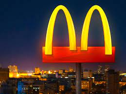
More recently, McDonald’s Brazil reimagined its logo in light of the COVID-19 pandemic. They separated the iconic Golden Arches, in an effort to show solidarity with customers stuck in quarantine and to comply with the social distancing guidance. The attempt at solidarity was internationally frowned upon for being insensitive and exploiting the situation for publicity purposes.
John Lewis
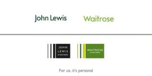
A rebrand to John Lewis & Partners and Waitrose & Partners was intended to “differentiate” and highlight the brand’s purpose. The inclusion of the wording ‘& Partners’ instead confused consumers, despite also being a mouthful. They received a 45% plunge in profits as a result of the rebrand!
British Airways
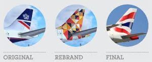
When your brand is based around heritage and tradition, removing that can be an absolute disaster! British Airways decided to change their tails’ designed with fifty national flags, as research concluded that 40% of BA customers were British. The main problem with some rebrand projects such as this, is that we often forget, “if it is not broken, don’t fix it”.
If you want to avoid such branding failures then get in touch with team OWB, now is the time to create a meaningful impression and think seriously about how you want to project your brand! If you are wanting to create an effective branding strategy get in touch with the team today.


